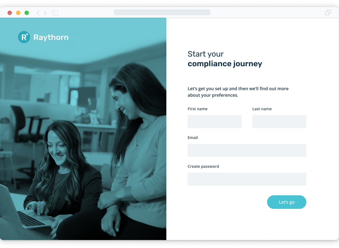
Customer onboarding
Cutting through the noise to deliver relevant compliance insights, faster
complianceandrisks.com
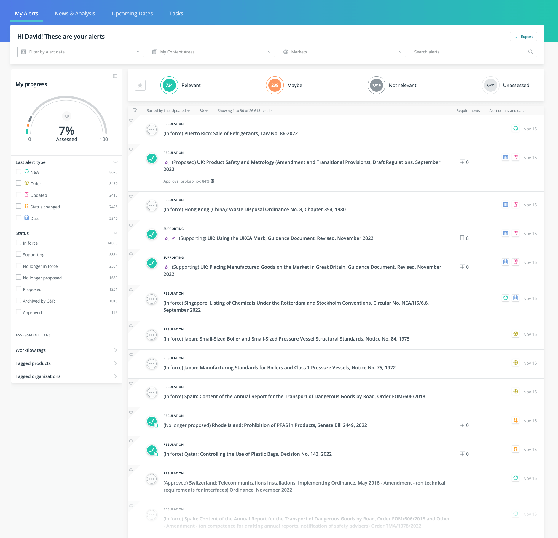
At the heart of it, C2P Compliance is a news feed of global regulations and standards which many of the biggest multinationals use to manage their product compliance and ship safe products.
Yet they were suffering from a content avalanche. The question was, how do we give them only what is relevant and not drown them in the process? 😬
The success
Relevance
45%
Reduction in irrelevant content in user's inbox
Activation
26%
Increase in user activation
Support
40%
Fewer platform setup support tickets
Our product compliance team is under enormous strain at the moment. We have the hardest job in the organisation. Too many regulations from every corner of the world to keep track of. And we make hundreds of products! We can’t do anything until we have filtered out all the outdated and irrelevant regulations.
Product compliance manager, top 10 multinational
Product compliance manager, top 10 multinational
01. Problem & goals
An avalanche of irrelevant content
The platform's greatest asset, its comprehensive library of over 90,000 regulations, had become a significant usability barrier. We received consistent feedback that compliance teams were drowning in a 'content avalanche' of irrelevant information. This initial information overload was causing frustration and preventing users from quickly finding value in the product.
Problem statement
Compliance teams are unable to work efficiently because the platform’s comprehensive library, creates information overload. Users need a way to easily surface relevant regulations without being blocked by thousands of irrelevant ones.
The current inefficient approach
The 'Inbox' was our current solution which had worked up to a point, but with the flood of new regulations in over the past 2 years, it was difficult to keep up.
There are many irrelevant to a specific company, that need to be filtered out to be manageable. Since many regulations and standards overlap with each other and it is hard to keep track of the different permutations. 🤯
There needed to be a solution to filter down the amount of regulations before they arrived at the Inbox.
02. My role
Lead product designer
My central role was lead product designer, alongside one UX colleague and two project managers. From the very beginning, I was responsible for:
- Driving the design strategy
- Interviewing customers
- Planning ideation sessions
- Executing the design closely with engineering team
- Communicating with stakeholders
03. Research & discovery
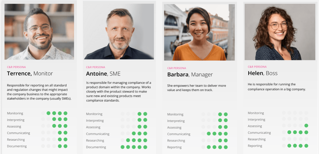
Understanding our users
To understand the problem deeply, we began with a research phase to gather evidence directly from our users, who are represented by four distinct personas.
Interviewing our users
We began by interviewing compliance teams about their experiences. The feedback confirmed they faced a daily irrelevant of content, with much of it being irrelevant, which added to their frustration.
- Too many irrelevant regulations
- Overwhelming avalanche of content
- Difficult to know the most important regulations to focus on
Digging through the data
I also looked at our analytics to find out how quickly users could assess content and flag it as relevant to them.
The data and analytics told us that most users had to do a lot of extra leg work. I saw that most users were scrolling through lists much longer than we had assumed they would, searching on an assortment of keywords just to get to the relevant regulation. They also were filtering frequently to filter down the content to what they could manage.
04. Synthesis & framing
Making sense of the findings
After gathering our research, the next step was to synthesize the findings into actionable insights. This allowed us to move from a general problem to a specific, solvable design challenge.
Using Jobs to Be Done (JTBD)
From our findings, we built job stories to focus on the user's needs and motivations. Instead of jumping to a solution, we created these stories to guide us. Our key insights were:
- Users need to filter content before they see the main interface.
- Users need to feel familiar with key concepts during their initial session.
- Users need an easier way to define their world of products, content areas, and regulations.
Job stories let us concentrate on the user's goal, which gives us a better insight into the personas using the platform.

05. The design challenge
Increase relevance
Based on my synthesised insights, I created a high level 'How Might We' question to frame the design problem. We confirmed the core challenge was to transform the initial experience from one of too much irrelevant content to one of focused and actionable clarity.
Design challenge
How might we streamline the initial setup process, so that new users can move from too much irrelevant content to a focused and actionable view to quickly find the most relevant compliance content?
06. Ideation & solution
Collaborating on ideas
With our design challenge clearly defined, I facilitated an ideation workshop to explore potential solutions. As the facilitator, I designed and ran this workshop to ensure we captured diverse perspectives from:
- Product management team
- Engineering team
- Customer success team
- QA team
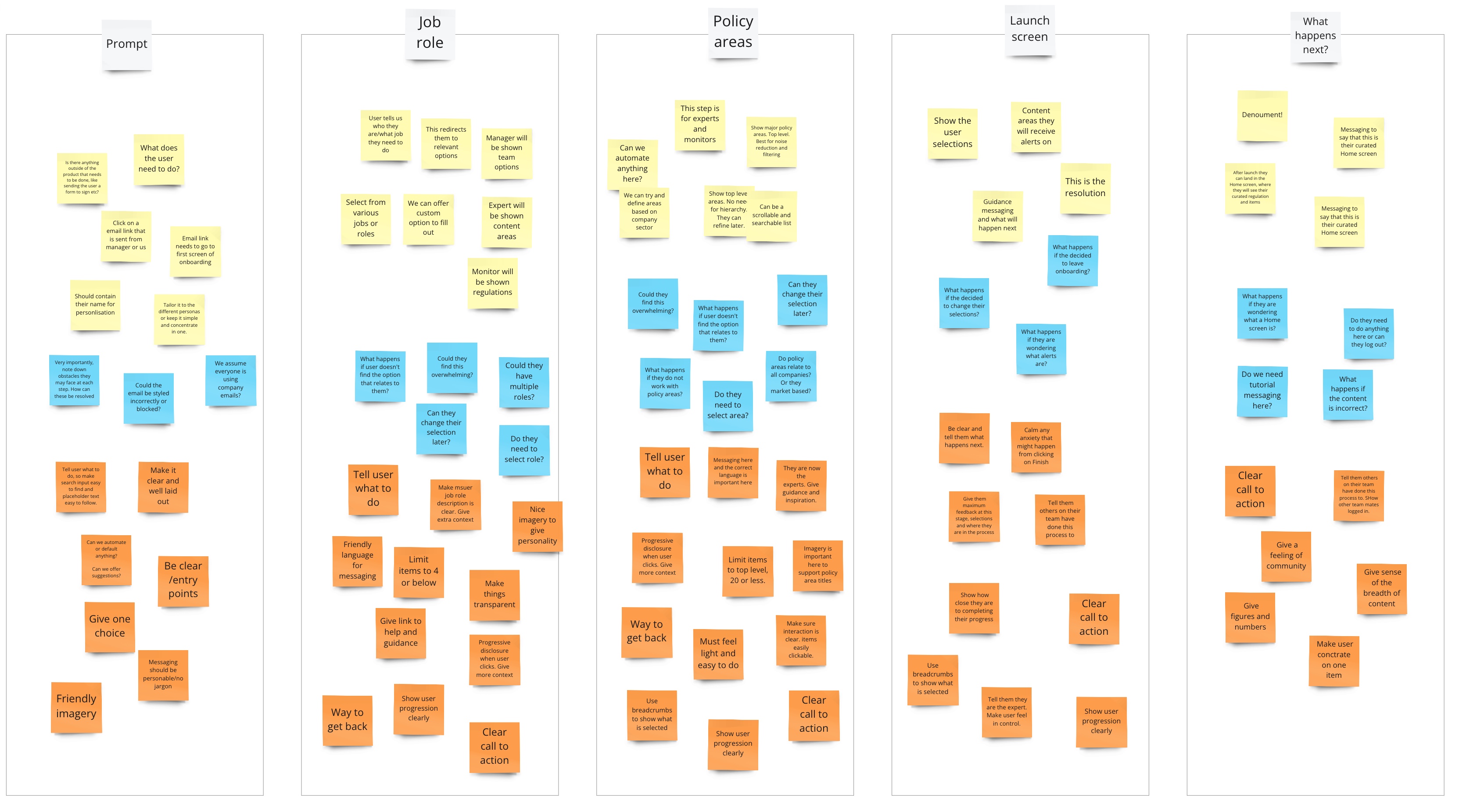
We used Miro as our whiteboard for two 2-hour sessions, one for generating questions and one for generating ideas.
The team gathered and generated ideas.
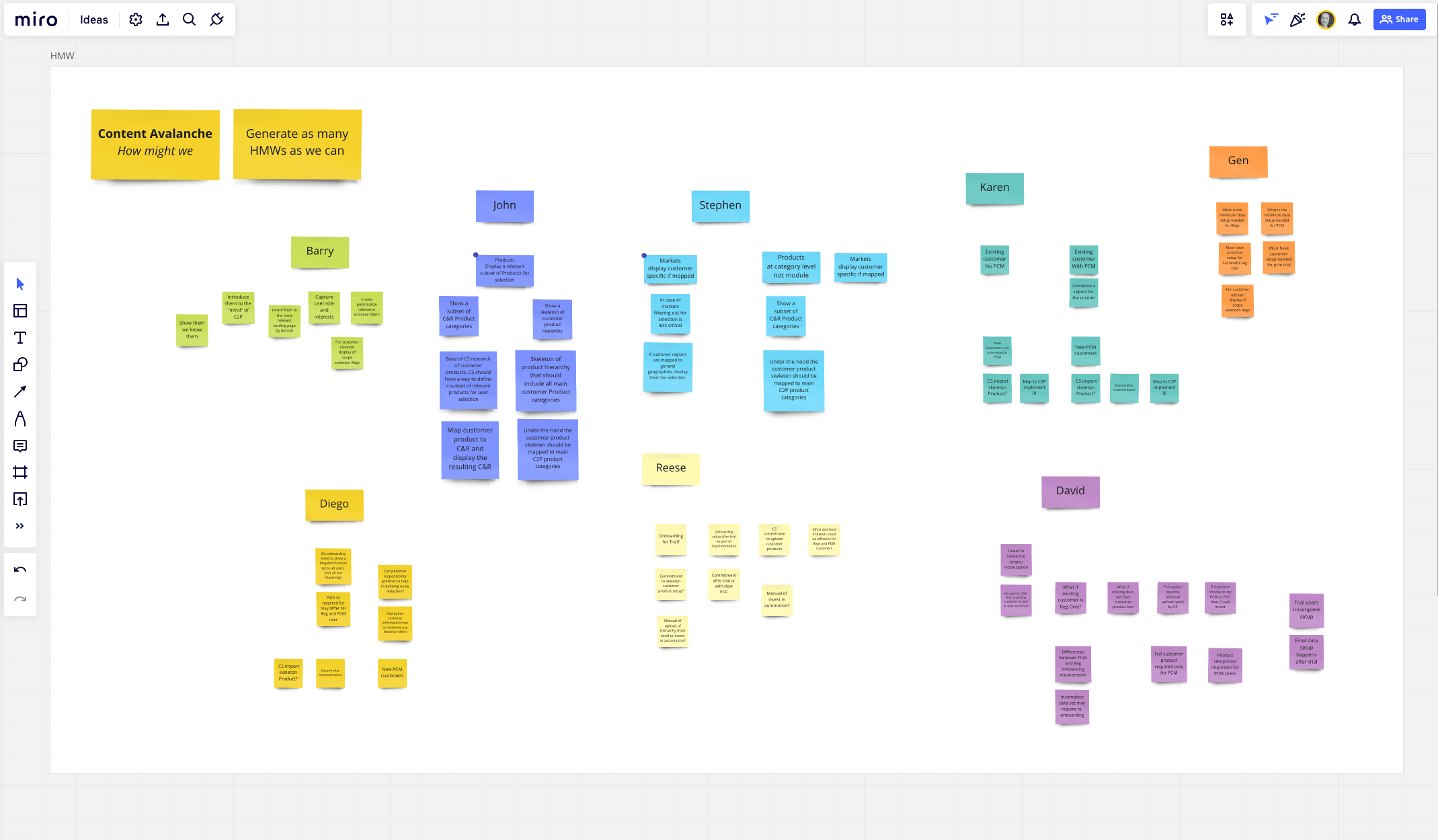
Using collaborative storymapping
Storymapping is a powerful way to map and visualise the user's journey through a product.
I setup ideation sessions with product and engineering teams. Storymapping opened our minds to ideas, and helped us discover potential obstacles.
Mapping the user's journey
Below is an example of a user journey with the basic steps a user needs to take to complete their goal.
Using Behavioural Design
To create a truly supportive experience, we grounded our design process in behavioural science. This approach uses psychology and motivation to build an environment that supports how users behave, rather than forcing them to conform to how our product works.

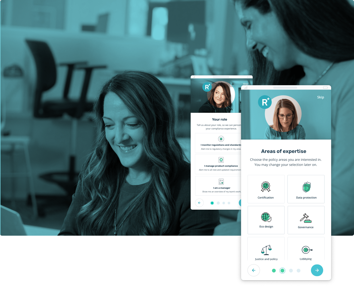
The solution
Finally, we chose our preferred solution, which was a comprehensive and easy to use onboarding experience.
Design solution
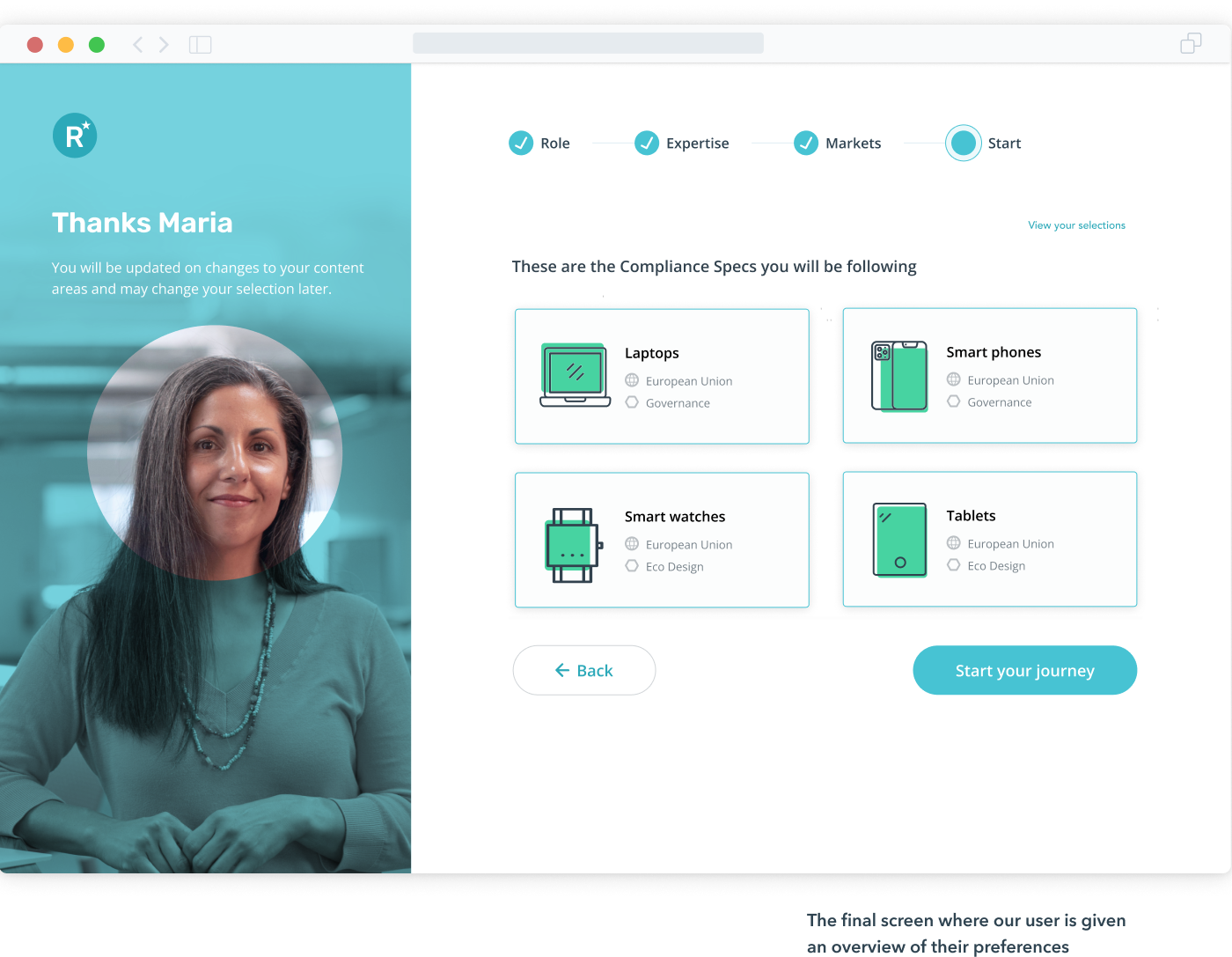
An onboarding flow will focus on guiding new users through setting up their experience using familiar compliance mental models. As a secondary outcome, this process will also introduce them to the platform's core concepts before they are presented with relevant content in the Inbox.
07. Design Exploration
Testing different layouts
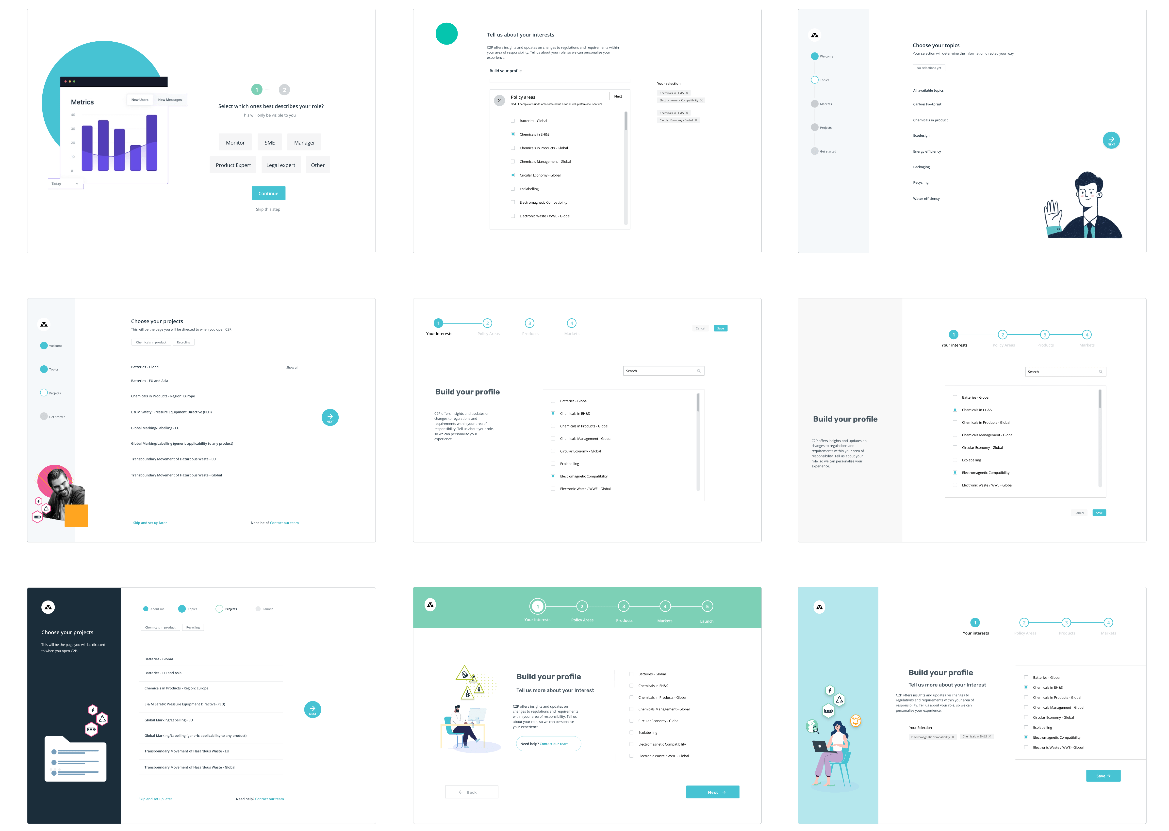
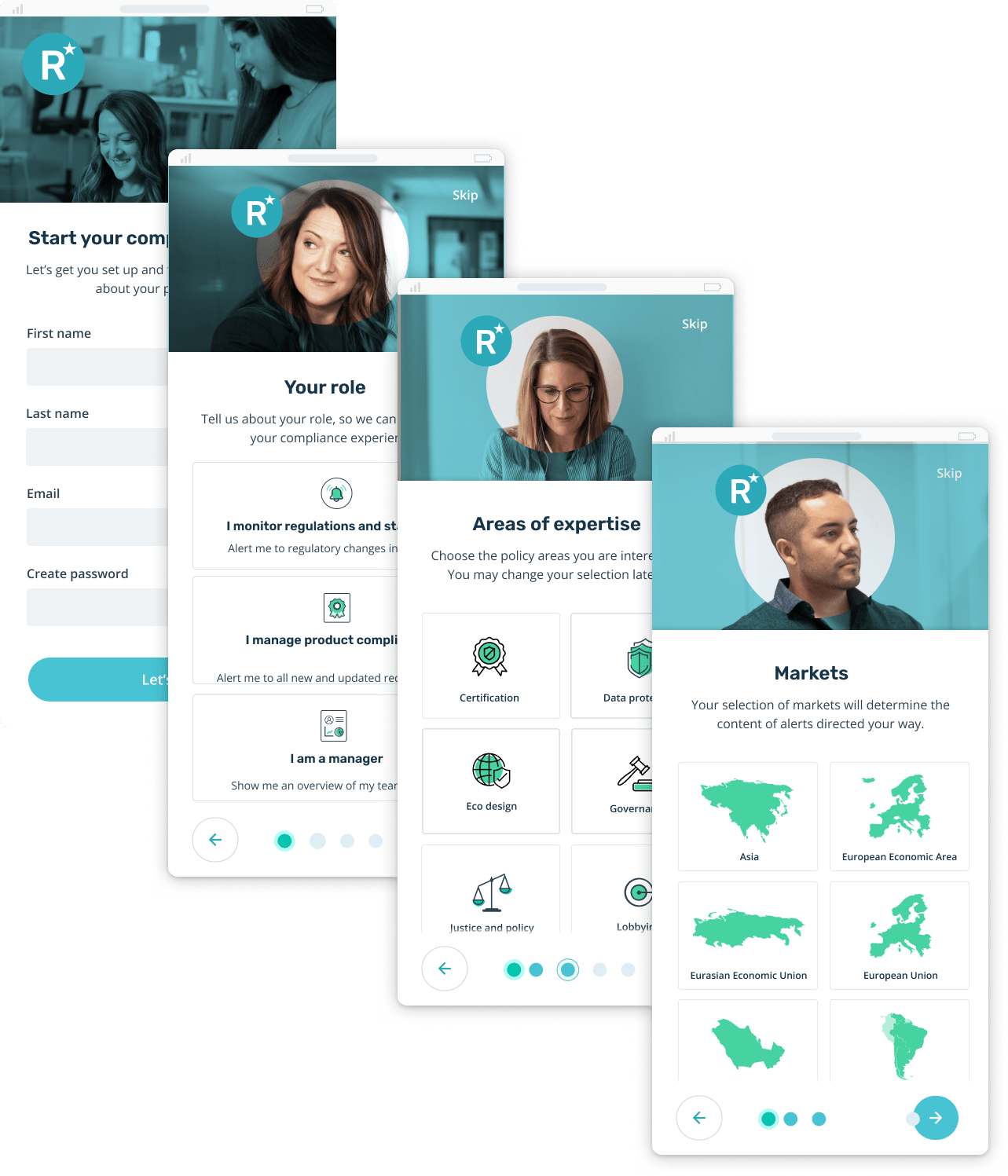
With a solid concept mapped out, I experimented with different layouts for an onboarding experience.
Some questions I wanted to explore were; should the stepper be on top or bottom, should the buttons be fixed on the bottom or top, what type of imagery should there be and where will it be placed?

How many steps should there be?
In the research stage, I found our users were accustomed to dealing with large amounts of content, and they were not put off by form filling. This guided our decision to extend the onboarding experience further than normal, to get more even more preferences from the user.

Visual explorations
Testing flows for
different personas
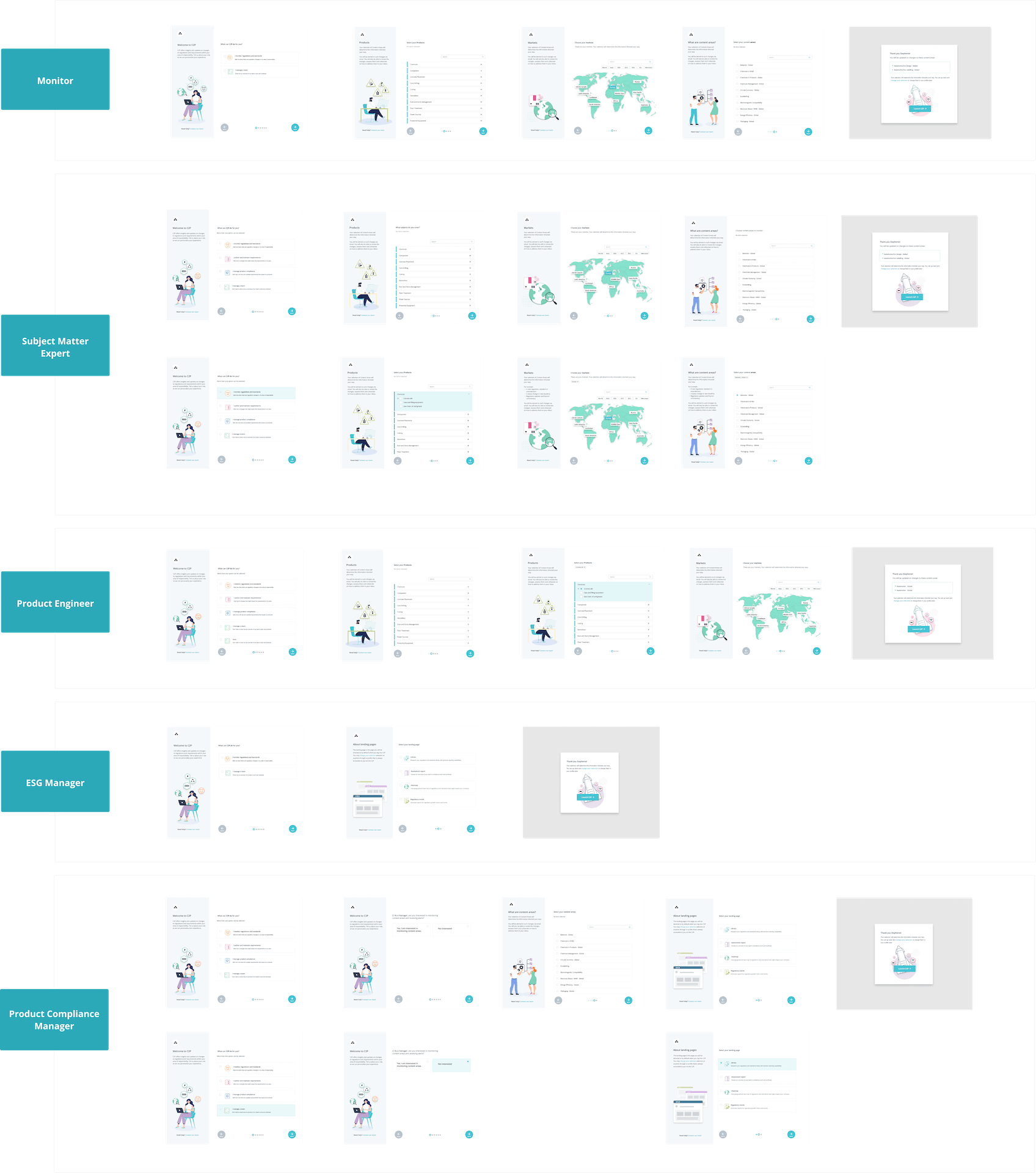
I built out relevant flows for each persona.
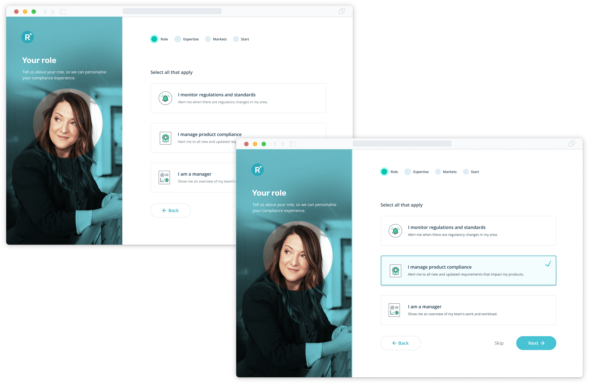
Managers didn't need to deal with products and markets, but they needed an overall dashboard and view of their team. Likewise, monitors who assess regulations didn't need a dashboard, but a more comprehensive view of products, markets and policy areas.
08. Final design solution
Bringing it all together
Colour palette
I choose a muted palette, as a strong colour palette could become tiring after a few screens. I chose aqua (which is our primary brand colour) and a complimentary green, to give a balanced and calm experience. As there are only a few actions, the aqua felt appropriate to be used here.

Iconography
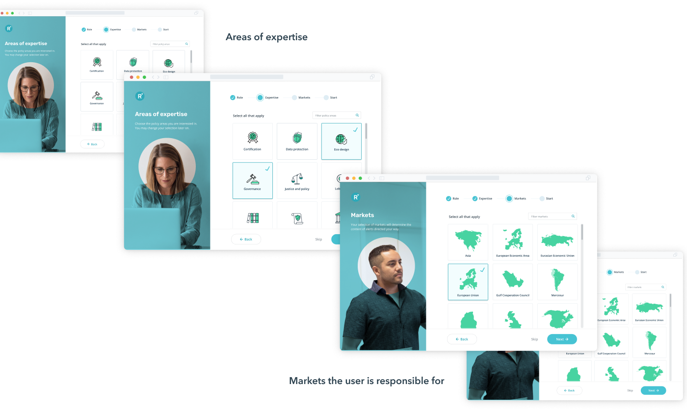
One of our big challenges is representing the many policy and regulatory areas that exist. Because of the complex concepts, we felt it was easier and more flexible to create icons instead of sourcing photographs that could be harder to comprehend when in a list.
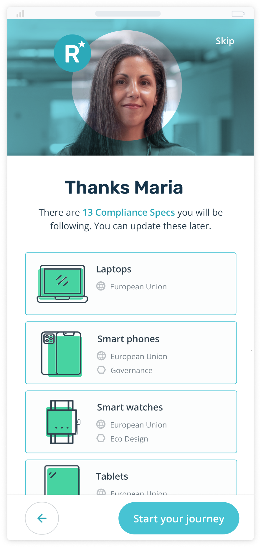
Screens
After more testing with hand-picked and engaged users and the internal team, we felt we had a strong user flow and end product.
10. Impact
A successful roll out
Prior to piloting our new onboarding with select customers, the team defined key metrics to measure the impact on user efficiency, confidence, and activation.
I created a dashboard to track user actions post-onboarding and used FullStory to review the setup interactions. We also sent customers a short satisfaction survey after they completed the new flow.
The results...
Relevance
45%
Reduction in irrelevant content in user's inbox
By personalising their feed from the start, users eliminated the noise and could focus only on what mattered.
Activation
26%
Increase in user activation rate post-onboarding
A smoother start led to more users fully adopting the platform within their first 30 days.
Support
40%
Fewer platform setup support tickets
Users were able to onboard seamlessly without asking for human intervention.
Efficiency
62%
Reduction in time to first relevant action
Users found their first critical regulation in minutes, not hours, dramatically speeding up their initial workflow.
Secondary outcomes
Internal training
Unified
Created a shared mental model for all teams
The onboarding flow became the primary tool for teaching new hires how compliance frameworks are built within the platform.
Shared understanding
Empowered
Sales and CS teams could now clearly explain product logic
This clarity gave the sales team more confidence during demos and helped customer success solve problems faster.
10. Future opportunities
AI powered evolution
Smarter recommendations
With the rise of AI, we can now use machine learning to provide even more personalised recommendations. We could suggest the most relevant regulations and standards, making the onboarding process even more efficient.
Use of natural language
This is an obvious improvement. It could allow a user to simply describe their business in plain language (e.g., "We are a pharmaceutical company that manufactures in Ireland and sells products across the EU and North America"). The AI translates this into a fully configured compliance framework, which the user could then review and approve.